Usability Redesign
SEVCO SECURITY
Timeline:
11 weeks
Team members:
Jen Zhang, Lori Cai, Ralph Chang
Overview
Through in-depth usability testing with enterprise security professionals, we transformed a dense data dashboard into a clear, actionable risk management workflow, directly influencing Sevco's product roadmap.
Background
The Company & The Product
Sevco Security is a B2B SaaS cybersecurity company that provides organizations with a centralized platform to manage and secure their IT assets. By integrating data from various tools, Sevco offers real-time insights into devices, software, and vulnerabilities, empowering security teams to prioritize and remediate risks effectively.
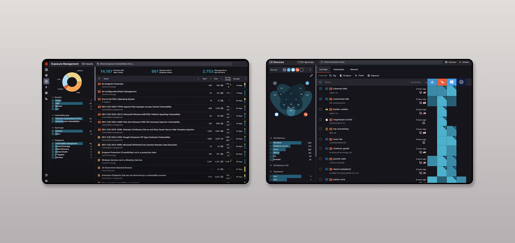
In 2024, Sevco launched a powerful new feature: the Exposure Management dashboard. This tool was designed to give security professionals a comprehensive, end-to-end view of the entire vulnerability lifecycle—from discovery and prioritization to remediation.
In 2024, Sevco launched a powerful new feature: the Exposure Management dashboard. This tool was designed to give security professionals a comprehensive, end-to-end view of the entire vulnerability lifecycle—from discovery and prioritization to remediation.

Challenge
While the new dashboard was rich with data and functionality, a critical question remained: Is the design intuitive and efficient for the expert users it was built for?
Security professionals operate in high-stakes environments where speed and clarity are essential. Any friction in the workflow, confusing interface elements, or disruptions in their mental model could hinder their ability to move from analyzing data to neutralizing threats. Our challenge was to step into their shoes, identify these critical usability gaps, and provide a clear path toward a more streamlined and user-centered experience.
Security professionals operate in high-stakes environments where speed and clarity are essential. Any friction in the workflow, confusing interface elements, or disruptions in their mental model could hinder their ability to move from analyzing data to neutralizing threats. Our challenge was to step into their shoes, identify these critical usability gaps, and provide a clear path toward a more streamlined and user-centered experience.
At a Glance
Key Insights & Recommendations
Through our research with cybersecurity professionals, we identified three critical disconnects between the dashboard's design and the users' real-world needs. These insights formed the foundation of our strategic recommendations to Sevco.
INsight 1:
Customization & Personalization
The "One-Size-Fits-All" design is failing expert workflows
Security experts with different roles—from IT analysts to CISOs—have vastly different priorities. We found that the static, uniform dashboard forced all users into the same view, creating noise and slowing down their ability to focus on the vulnerabilities that mattered most to them. All 7 participants expressed a need for personalization.
Proposed Enhancement:
We recommend empowering users with customization tools, allowing them to create a focused environment that aligns with their unique responsibilities.
INsight 2:
Broken Workflow & Disrupted Information Hierarchy
The path from "finding a problem" to "fixing it" is broken.
In a high-stakes environment, clarity is paramount. We uncovered multiple instances of UI inconsistency that caused confusion and hesitation. Users wasted valuable time trying to decipher unclear icons and mismatched labels instead of acting on the information presented.
Proposed Enhancement:
Enable In-Dashboard Actions for a Seamless Workflow. By bridging the gap between insight and action, we can transform the dashboard from a simple reporting tool into an integrated command center, helping users resolve threats faster.
INsight 3:
UI inconsistency
Inconsistent UI and vague iconography increase cognitive load.
A user's ultimate goal is not just to analyze vulnerabilities but to remediate them. However, our research revealed a fractured workflow that forced users to leave the main dashboard to take critical actions, causing significant frustration and inefficiency for 5 out of 7 participants.

Proposed Enhancement:
Enhance UI Clarity and Visual Consistency. We proposed strengthening user confidence and speed by standardizing the interface's visual language, ensuring all interactive elements are clear, predictable, and easy to understand at a glance.
How We Got There
Our Approach & Methodology
We chose remote moderated usability testing as our primary methodology. This approach allowed us to observe participants' natural interactions with the product in real-time while using a think-aloud protocol to capture their in-the-moment thoughts and rationale.
Test Environment
To protect client confidentiality, we conducted all tests within a dedicated demo environment populated with realistic, anonymized data.
Tasks & Scenarios
We designed two primary task scenarios that mirrored real-world challenges security professionals face, focusing our follow-up questions on the discoverability, comprehension, and efficiency of the features used.
Data Collection
Each session was conducted over Zoom, with one moderator guiding the participant and 1-2 dedicated notetakers capturing observations. All sessions were recorded (with consent) to ensure a thorough analysis.
Participants
People we spoke with
With the help of Sevco's customer service team, we recruited a diverse group of participants that provided a well-rounded view of the user experience. Our panel included: 1 first-time user, 1 basic user, 3 experienced users, and 2 internal engineers

P4-AA
Role: IT Security Analyst
Company info:
QC
Team Size:
Team of 10, 6 admins
Device Assets
~2800
User Assets:
~6200
Experience:
First-time user of Exposure Management feature, haven’t acept the training session

P1-CHI
Role: Head of Info Security
Company info:
Sevco
Experience:
Internal engineer of Sevco, very experienced in using Exposure Management feature

P6-SS
Role: Sevco Sales Eng
Company info:
Sevco
Responsibility:
Demo product to customers and run 30-day trials with them
Experience:
Internal engineer of Sevco, very experienced in using Exposure Management feature

P2-BK
Role: Head of Info Security
Company info:
PM
Team Size:
Team of 27, 6 admins
Device Assets
~48k
User Assets:
~69k
Experience:
experienced user of Exposure Management feature

P7-ALT
Role: IT ENgineer
Company info:
PM
Team Size:
Team of 14, 5 admins
Device Assets
~1100
User Assets
~1100
Experience:
Experienced user of Exposure Management feature

P3-MW
Role: Director of it Security
Company info:
GHI
Team Size:
Team of 35, 2 admins
Device Assets
~7500
User Assets:
~5100
Experience:
experienced user of Exposure Management feature, regulatory usage

P5-FS
Role: security ENgineer
Company info:
FSI
Team Size:
Team of *, * admins
Device Assets
****
Device Assets
****
Experience:
Used Exposure Management feature several times before
All personal and company names have been replaced with pseudonyms.
*: participant have chosen not to publicly disclose the specific number
Key Task Scenarios
Our test was structured around two main, open-ended tasks that prompted users to engage with the dashboard in a realistic way. The scenarios were designed to evaluate the platform against our core research questions on discoverability, comprehension, and efficiency.

Task 1:
Access and Understand the Exposure Management Page
We first asked participants to find the Exposure Management page from their typical starting point within the application. Once there, we prompted them to explore the interface and verbalize their understanding of its purpose and the information presented. This allowed us to assess the feature’s discoverability and the clarity of its information architecture.

Task 2:
Identify, Prioritize, and Analyze a Vulnerability
We then asked participants to simulate a typical workday by finding a vulnerability, explaining their process for choosing it, and using the dashboard's features to understand its context. This core task allowed us to observe how users navigated the interface to achieve a primary goal and how they utilized features like filtering and sorting to analyze and prioritize issues.
P5-FS:
“It takes me some time to realize what these bars are and where they are on the right side.”
P7-ALT:
“Does the Open count include 'In Progress'? Unclear-it'd be helpful to define the stats further and distinguish Open, In Progress, and Total.”
P2-BK:
“I like the categorization at the left but needs it to stay under 10 categories or even less in order to remain useful.”
P4-AA:
“Even with this popup(severity level and days), I still don’t quite understand how these icons work”
P1-CHI:
“What I want to know when thinking of the devices with a problem, is how important those machines are.”
P3-MW:
“We trust Sevco's prioritization on risk level”
Synthesis & Analysis
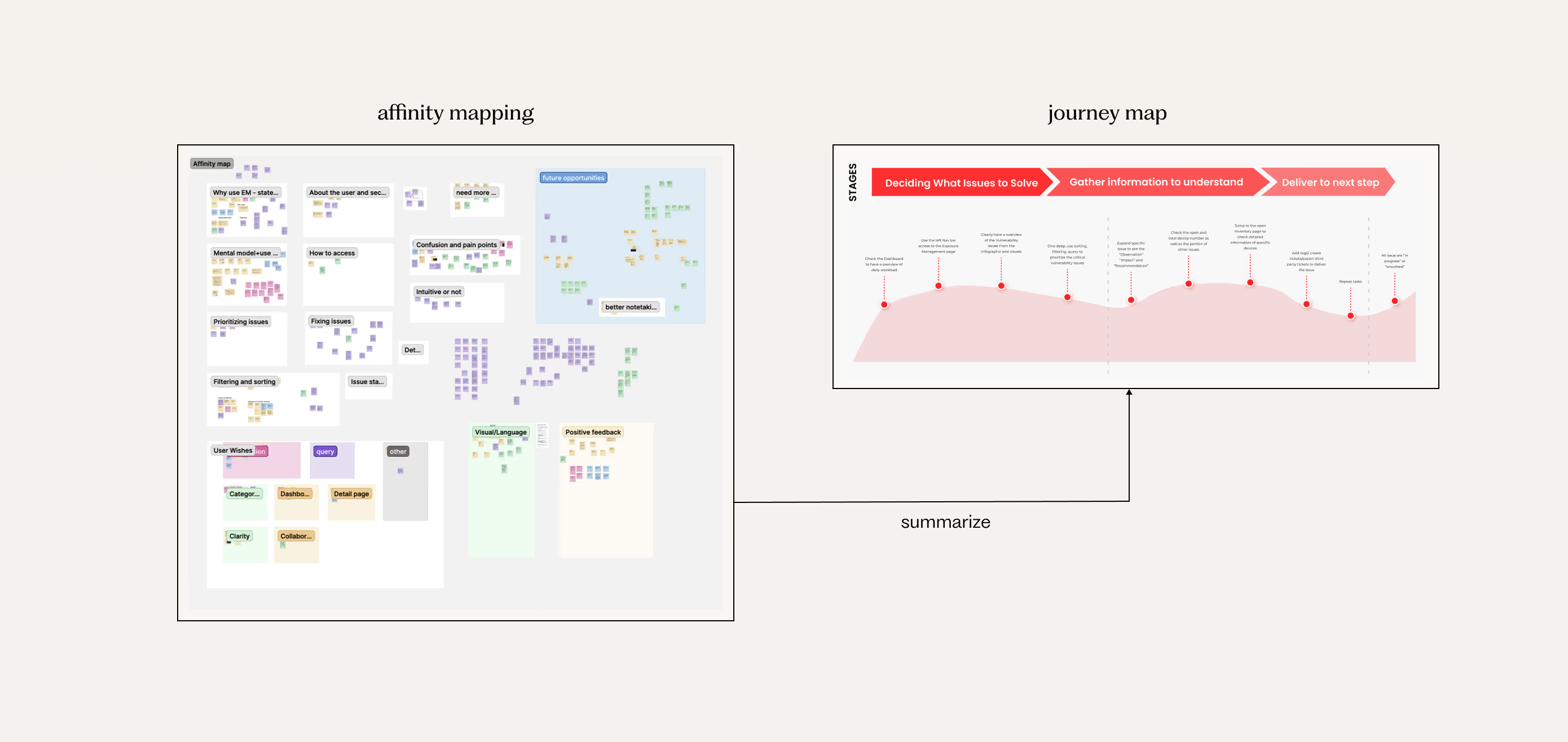
Gather & Organize
After conducting the interviews, our team had gathered over 500 individual notes for analysis. Each team member first compiled and organized their own notes into a clear format.
We then combined the notes from multiple notetakers for each participant, eliminated duplicates, and identified the major themes and pain points for each individual user session.
We then combined the notes from multiple notetakers for each participant, eliminated duplicates, and identified the major themes and pain points for each individual user session.

Synthesis & Analysis
Cross-Participant Affinity Mapping and Journey Mapping
With the data organized on different topic basis, we moved to a cross-analysis. We used affinity mapping to compare and identify the major recurring themes, workflows, and challenges that appeared across all participants.
A user journey map is then created to highlight key moments we discovered in the workflow. These key moments reflect pain points and satisfaction moments when user using the Exposure Management.
A user journey map is then created to highlight key moments we discovered in the workflow. These key moments reflect pain points and satisfaction moments when user using the Exposure Management.
Recommendations
A Deep Dive to Our Findings & Solutions
Here, we'll explore the evidence behind our key insights and detail the specific design solutions we proposed to address each usability issue.
Finding 1:
A customizable view will benefit users with different role-specific demands.
While the dashboard provided a wealth of information, its one-size-fits-all approach was a primary source of friction. We observed that every single external participant (7/7) attempted to filter or adjust the dashboard to better suit their immediate task, proving that a generic view is a fundamental misalignment with their mental model.
Our Solution
Enable Custom Views and Savable Queries.
To solve this, we proposed three specific features that transform the dashboard from a static report into an interactive workspace:
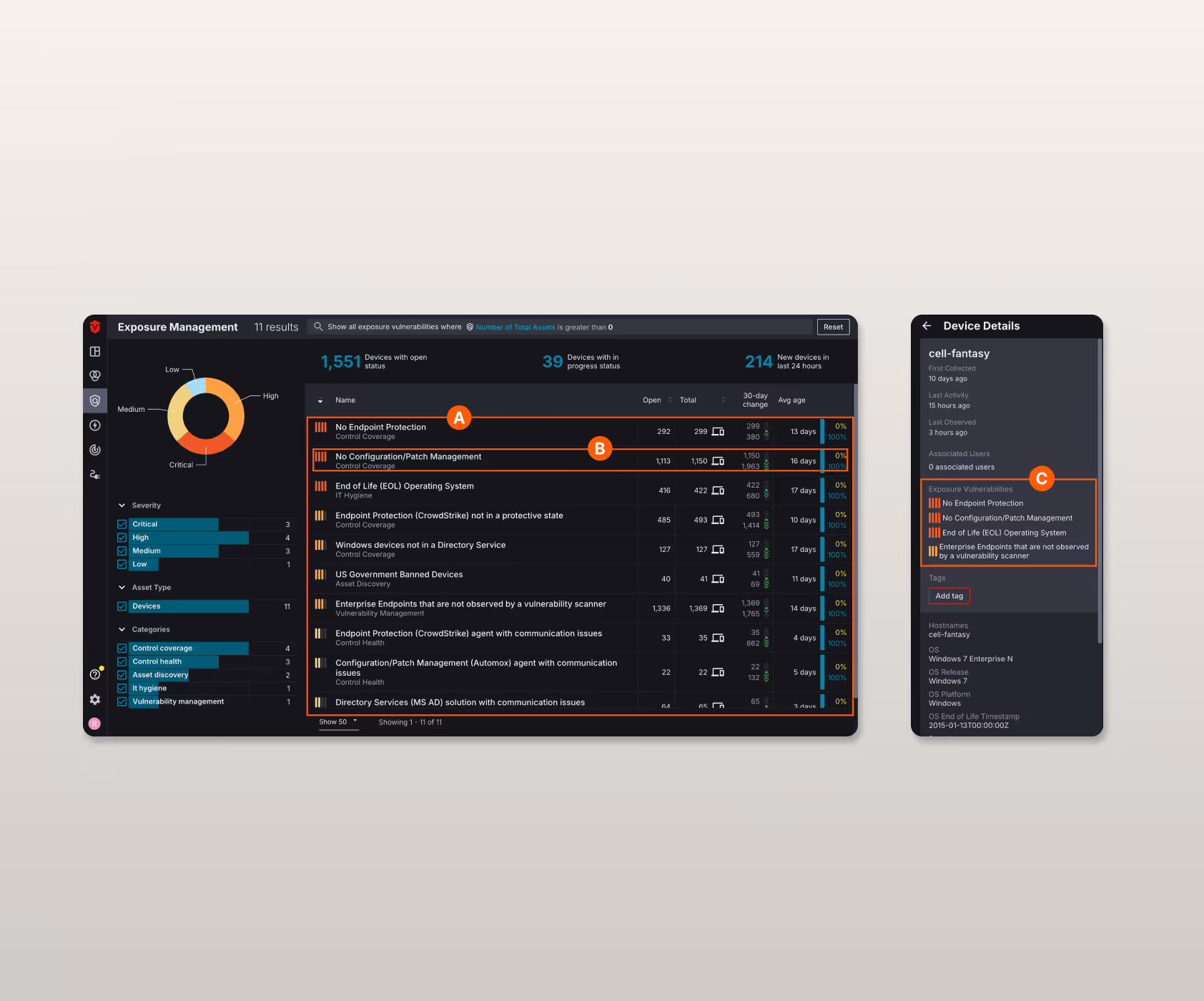
A
Dashboard Customization
Allow users to hide specific issue categories they deem irrelevant to their role.
B
Savable Queries
Users could build a complex filter and save it as a new, clickable category in the left-hand navigation, streamlining recurring tasks.
C
Refined Scoring
A more nuanced quantitative measurement that incorporates information from multiple EM issues on an asset to quantify risk across all controls.
Finding 2:
A connected workflow between analysis and action would boost remediation efficiency.
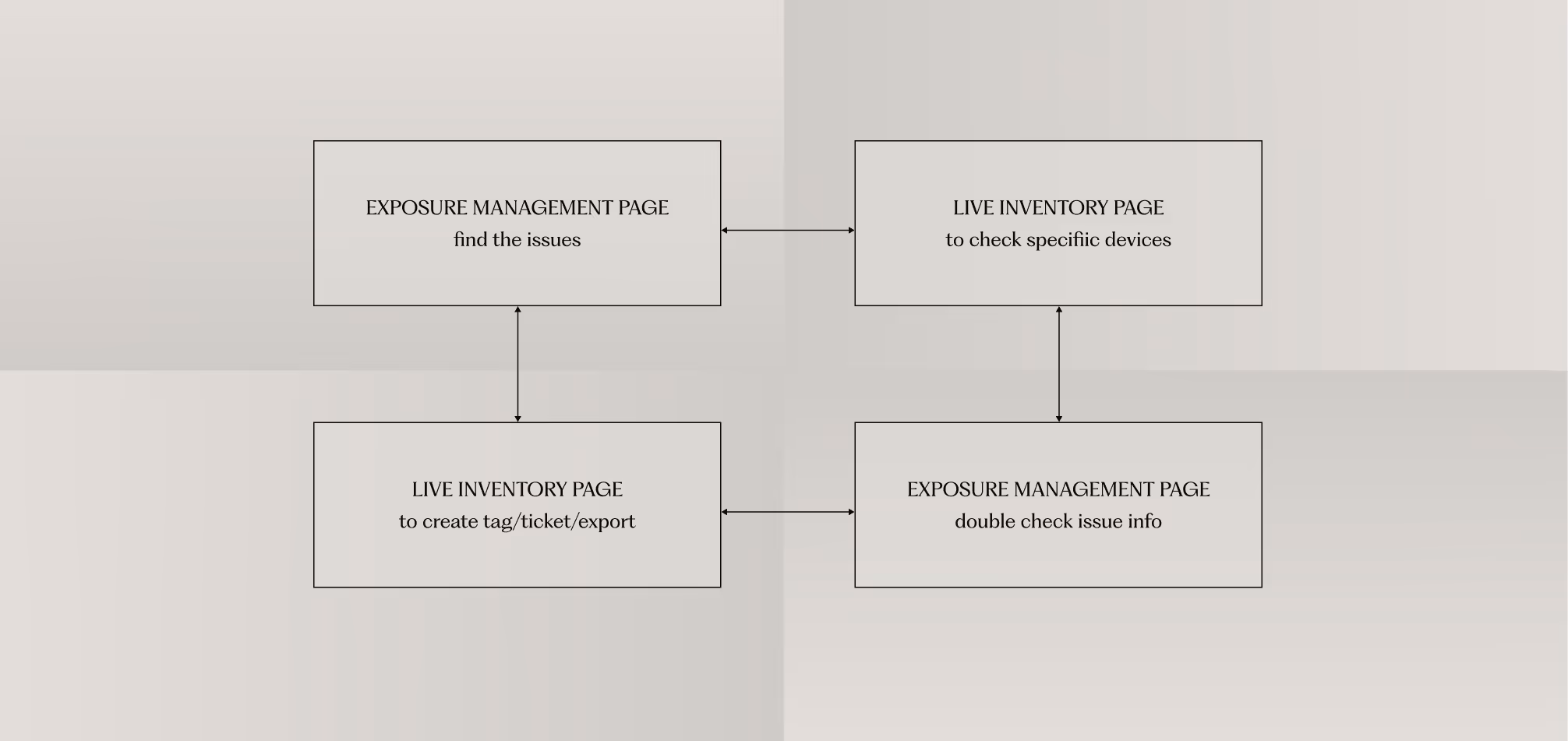
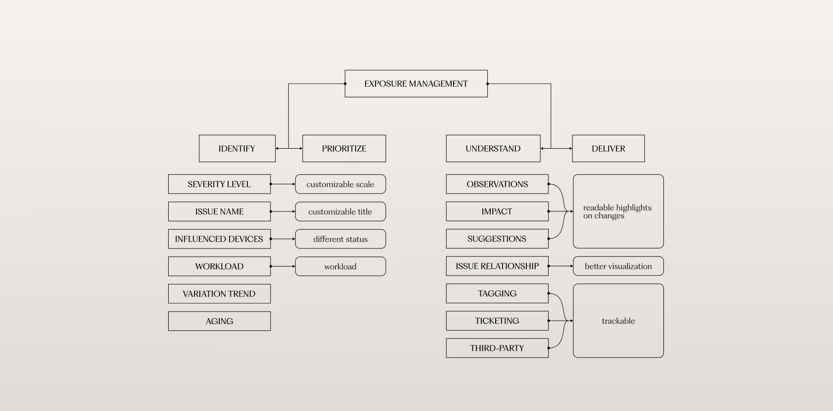
The most significant usability issue we uncovered was the disconnect between analysis and action. Users repeatedly had to switch between the 'Exposure Management' page (to find issues) and the 'Live Inventory' page (to act on them).
To understand the root cause of this frustration, we mapped the user's information hierarchy—the mental model they use to process information and make decisions.
Our analysis of this hierarchy revealed a critical disconnect: the dashboard is effective for the 'Identify' and 'Prioritize' stages. However, when users progress to the 'Deliver' stage, where they need to perform actions like 'Ticketing' or 'Tagging', the necessary tools are located on an entirely different page. This forces them to break their cognitive flow, leading to the inefficient back-and-forth we observed.
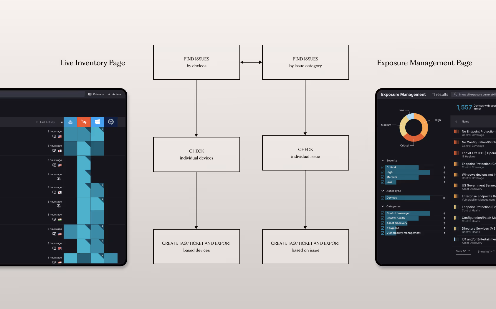
Our Solution
Align the Workflow with the User's Mental Model.
The solution is not just to add buttons, but to realign the interface with the user's natural decision-making process. We proposed embedding key action items (like 'Create Ticket' and 'Add Tag') directly into the issue details on the Exposure Management page. This consolidates the entire workflow into a single, seamless experience, as illustrated in our proposed user flow.
Finding 3:
Consistent and intuitive visual language is needed to eliminate confusion and increase user confident.
In a high-stakes environment where speed is critical, we found that small UI inconsistencies led to significant hesitation. Most users reported reliability issues with the iconography and content language used on the page. Although users were able to understand the meaning of icons and terms after a short instruction, it is very difficult for first-time users or even experienced users to fully comprehend the information shown on the page without explanation.

Our Solution
Redesign for Clarity and Predictability.
A
Adding Text to Icons
We proposed adding a clear text label next to the severity icons for immediate recognition, eliminating ambiguity.
B
Universal Tool Tips
Implementing a universal hover tooltip helps users develop a mental model of hovering on terms they do not understand for explanation.
C
Header Layout
We redesigned the table header to include clear titles and consistent spacing for sorting arrows, preventing user error and confusion.
OUTCOME
What we delivered
Our research and analysis had a direct and meaningful impact on Sevco's product strategy. The project concluded with the successful delivery of a comprehensive final report and presentation to the product team.
The key deliverables and outcomes included:
The key deliverables and outcomes included:
11 Key Usability Insights
We successfully identified and documented 11 distinct usability issues, categorized into three major themes.
14 Actionable Design Solutions
For each finding, we developed specific, evidence-based design solutions to address the core problem, providing a clear path for product improvement.
Informed the Product Roadmap
Our findings and solutions were positively received by the Sevco team and directly informed their product development roadmap, ensuring that future iterations of the dashboard would be more closely aligned with user needs and mental models.
Key Takeaways
What we have learned
For Expert Users, Efficiency is the Core of Usability.
We learned that expert users in a high-stakes environment like cybersecurity value efficiency above all else. A design that streamlines their workflow and removes even small points of friction can provide immense value.
Workflow Over Features.
Our most critical insight was the discovery of the fractured workflow. This taught us that a successful design must consider the user's entire end-to-end goal, from initial analysis to final action, and ensure the interface supports that journey seamlessly.
Small UI Inconsistencies Erode Trust.
In a data-rich environment, clarity and consistency are fundamental to the user's trust in the product. We saw firsthand how small details, like a mismatched icon, can cause hesitation and undermine a user's confidence in their ability to make quick, accurate decisions.


